- Schiavo controversy--done
- Election 2004--read on in this entry
- War in Iraq--not going to cover this
- Midwest Farmers' Union v. the State of Iowa (the Great Corn Scandal of 2002)--yet to come!
Anyway, it's 1:45 in the morning, and without further ado, here are a few comments on the cartograms produced for the 2004 election. These are great devices as they convey a large amount of information in visual form. Evidently there's a science behind the making of them, as it's difficult to adjust proportions without distorting the shape too much.
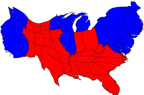
This first one represents the states' results (Republican, of course, being red, and Democrat, blue) as well as their relative representation in the Electoral College. Even though there are many more red states than blue, the surface areas are approximately equal. This is because the blue states, on average, are larger in terms of population and hence have more representatives in the House.
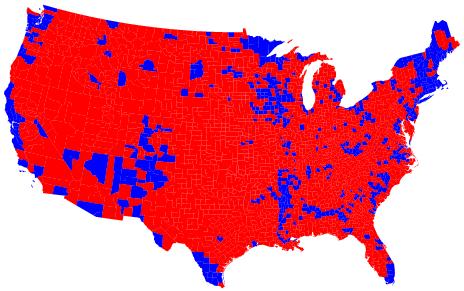
I thought this next one was impressive. It shows the USA divided up county by county. (Apologies to Alaska and Hawaii.) In contrast to the first cartogram, this one emphasizes how the blue areas tend to be focused in major metropolitan areas. I can see LA, San Diego, San Francisco, New York, the entire state of Massachusetts, Miami, etc. Knowing that the popular vote wasn't far from 50/50, this map also tells us that as a whole, the red counties have a much lower capita per square km.
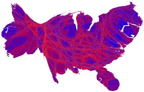
This one's my favorite. You may have thought it's a topographical map of Burma. In fact, it shows the United States divided up county by county, with a continuum of color. For instance a county that went nearly 100% Democrat would be blue, 100% Republican would be red, but most are a mix--hence various shades of purple. In addition, the counties are shown sized in proportion to their population. Again, we can see San Francisco on the west coast, as well as gigantic LA and Orange Counties. On the east coast, notice how large Long Island is. And Cook County is clearly visible just boardering Lake Michigan.


3 comments:
I like how you can pick out Travis county on the 2nd to last map.
We would really like for you to cover the war in Iraq, however. Many of us have been confused and unsure what to think.
~DH
I actually shave biopsied that last map off of an elderly lady's back last month. The borders seemed irregular with variegated colors so I figured better safe than sorry.
California has developed somewhat of a complex of late after overhearing an off the cuff "don't want a border with that fat chick" comment Arizona made to Nevada last week.
What is freakin' wrong with you?
Clint
Post a Comment